GBS Cleaning Brand Refresh + Website
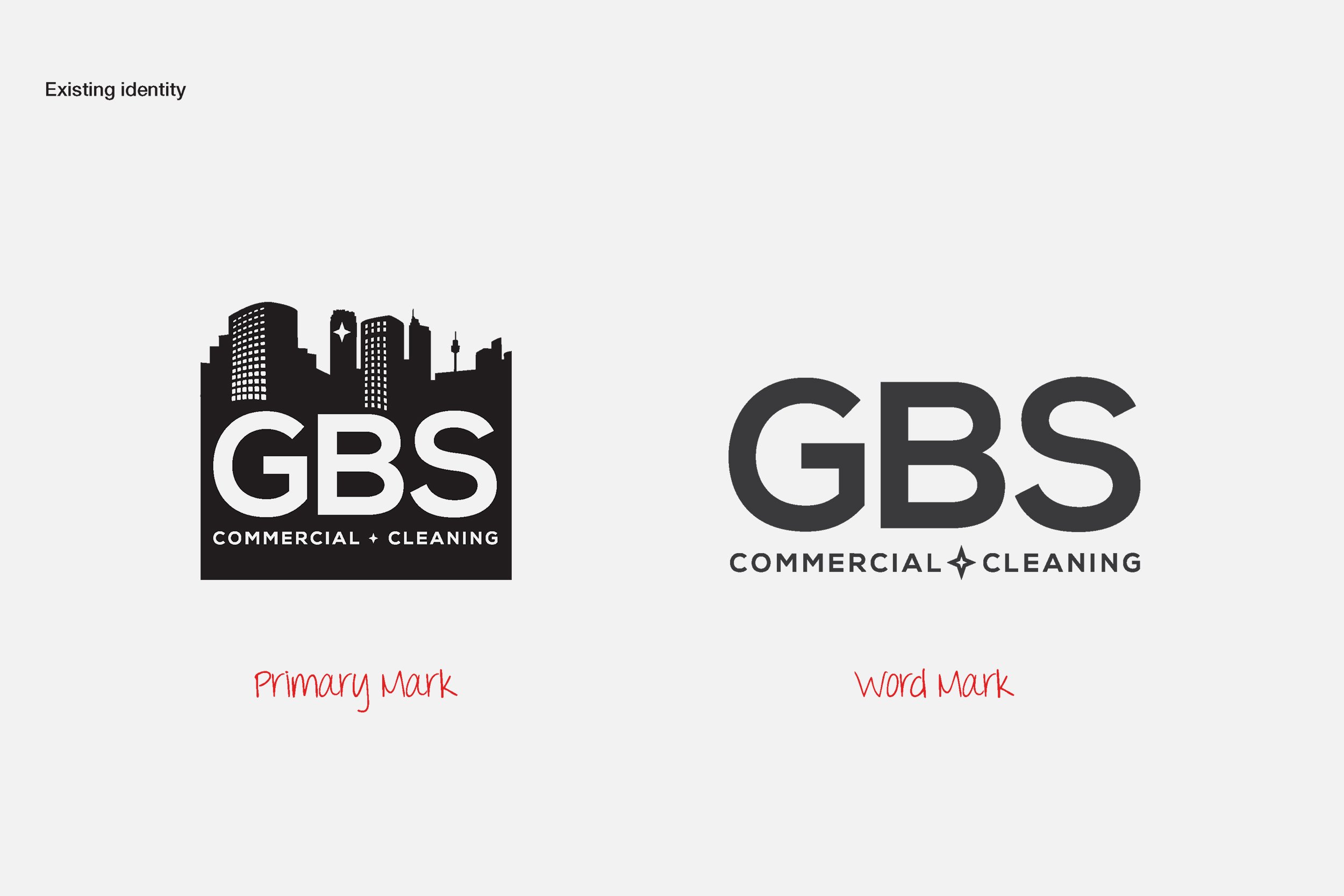
The client asked us to refine their existing brand identity to make it cleaner, crisper, and easier to use—especially on social media and mobile devices. Their original logo was quite busy and didn’t scale well. There was also a noticeable disconnect between their logo symbol and their wordmark, which made the brand feel inconsistent.
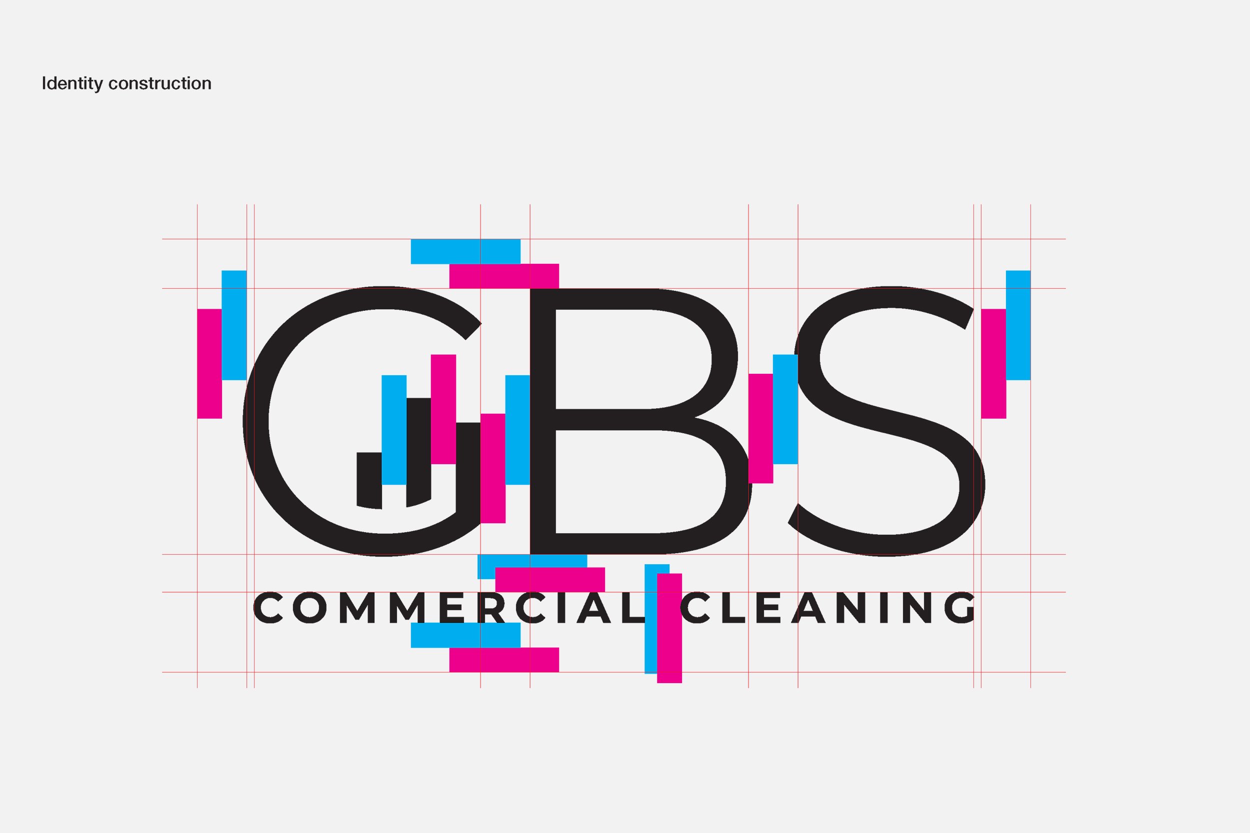
We started by selecting a sans serif font that felt similar to their original wordmark. This helped maintain recognition among existing customers while making the new version sharper and more legible at smaller sizes. Although the client initially wanted a text-only wordmark, we suggested incorporating subtle elements from their original logo—such as shapes inspired by the city skyline. This helped create a unified brand that works well across all platforms.
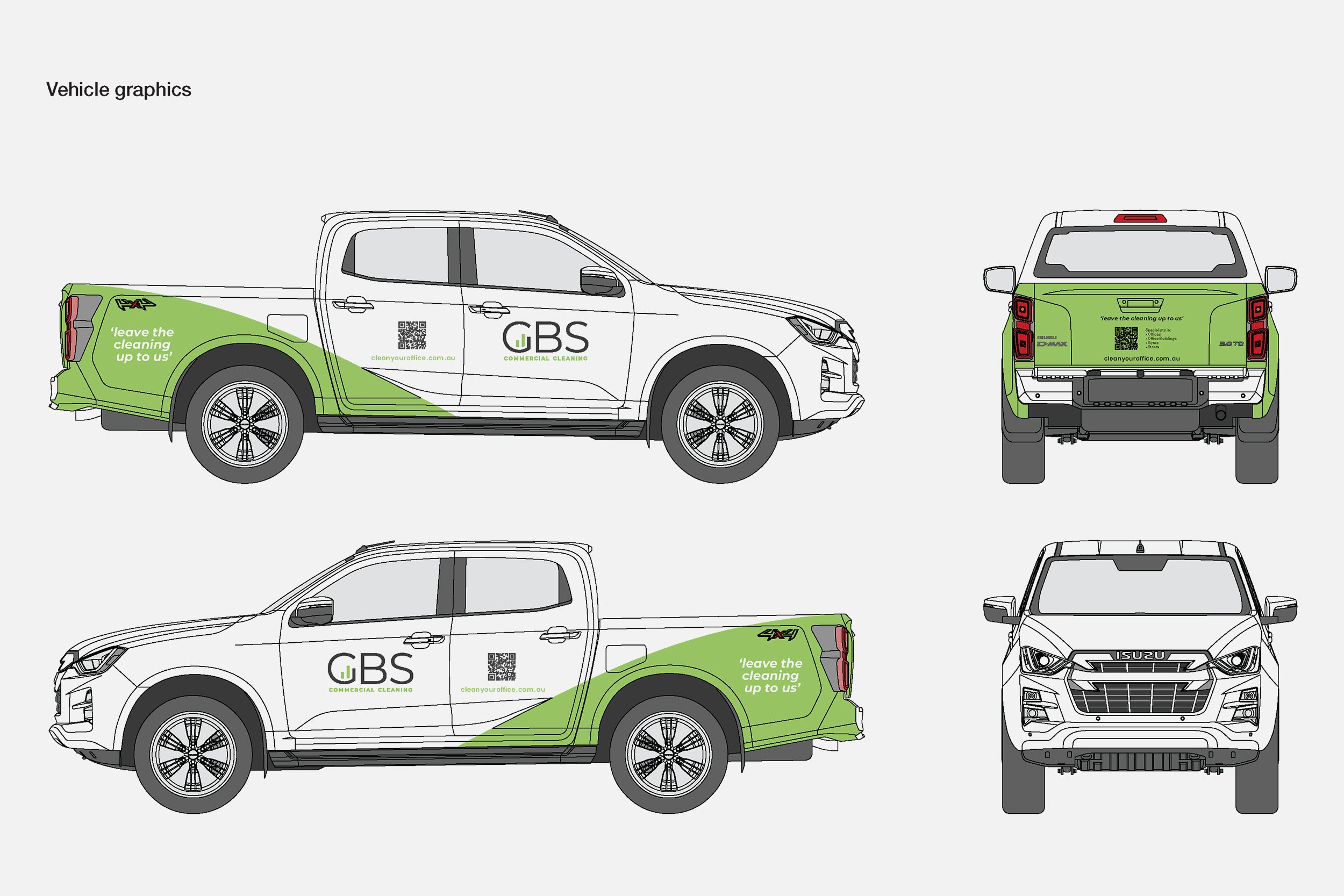
We carefully refined the final logo design and applied it consistently across uniforms, vehicle graphics, and a clean, simple website that supports their marketing efforts.
Explore the new website at gbscleaning.com.au